Web Persephone: Variants
The Variants dialog
Persephone organizes variants (such as SNPs or insertions/deletions) into samples, which usually correspond to columns in the original VCF file. You can filter all available samples (by name, qualifier value, and other properties); select samples of interest; preview their contents and perform real-time analysis; and then display them alongside other tracks on a map in the form of a Variants track.
To select the samples you wish to display, open the Variants explorer dialog by selecting Tools | Variant explorer from the main toolbar:

Alternatively, right-click any map to open its context menu. If the Persephone database contains samples for this map, you will see the Variant explorer menu option:

The counter shows the number of currently selected samples (in this case, 0) as well as the total number of samples available for the current map (in this case, 3,202).
The Variant explorer dialog displays summary information for all available samples in the database:

1: The Map Set and Reference sequence dropdown boxes at the top list all Map Sets with available variant samples, and the list of available sequences for the currently selected Map Set (e.g. its chromosomes).
2: The table of Available samples shows all samples that can be displayed for the currently selected Map Set and reference map. You can add them to the display by clicking the  button.
3: The tree on the right-hand side contains all the known properties and qualifiers of these samples. Check the checkbox next to a property to add it as a column to the tables of samples; you can then filter and sort the samples by the column.
4: The Displayed samples table contains the list of samples that are currently selected for viewing and analysis. You can preview their variants in the Preview panel below, and then click the Display map button to examine the variants in greater detail in the main map view. You can also click the Design assay sequences button (in the bottom-left corner of the dialog) to design a variant assay for the currently selected Map Set.
5: The Preview panel shows a preview of the variants for all the samples that are currently selected for display on the currently selected reference sequence. This preview is zoomable (just like the Persephone's main map view).
6: The Display options controls provide several ways to customize the preview, as well as to nominate the sample(s) whose alleles will act as the reference for comparison (instead of using the reference sequence).
Selecting the reference sequence
Click the Map Set dropdown box to open the table of all Map Sets with variants (if you arrived at the Variants dialog from the Tools menu, the dropdown box opens automatically):

You can filter and sort these Map Sets using Persephone's standard table filtering controls. After selecting the Map Set, select the Reference Sequence in the box to the right; this map will be used to preview the variants in the Preview panel below.
Adding and removing samples
To add some of the samples to the view, select them in the Available samples table, then click the  button to add them to the display. Your chosen samples will be moved into the table below, and a graphical preview of their variants will appear in the Preview panel:

As usual, you can filter and sort these samples by their properties, but you can also re-arrange them manually by dragging their drag handles with the left mouse button. By default, only a few of the basic properties are shown in these tables (typically just the name of each sample and number of variant sites for the sample in the currently selected Map Set), but you can select additional properties from the tree on the right. For example, you could find all samples whose "source" qualifier is "MC":

You can also group the samples by any column; for example, you can select the "ORI_COUNTRY" qualifier, and click the  button to group the samples by its value:

The "ORI_COUNTRY" column will be moved to the left side of the table, and the samples will be re-arranged into groups:

While the group is collapsed, numeric properties of all the samples within the group (in this case, #Variants) are displayed as averages. You can expand the group to view individual properties of each sample, and to add selected samples to the display. To return to the normal un-grouped view, click the  button.
To remove samples from display (and return them to the Available samples table), click the  button (alternatively, you can also right-click a row and choose Remove from the context menu).
You can also remove all samples from display at once, by clicking and holding the mouse over the Clear all button. The button will begin filling up with a darker color from left to right; once it fills in completely, all samples will be removed from display:

Assigning colors to samples
Each column in the main Selected samples table has a radio button under its header; the number of distinct values for that column is listed there as well. Click this radio button to assign a color to each sample based on this column's value:

Each sample will be marked with an automatically chosen color corresponding to a value (e.g. "Vietnam" is marked with the teal color).
If there are 10 or more distinct values in a column, they will not receive individual colors; instead, they will be marked with a two-tone gradient:

In this example, the smallest value (30.1) is shown in teal ; the largest value (37) in red ; and values in between are shaded accordingly (we've also sorted the table by the "depth" column to make this gradient easier to see).
Click the radio button in another column to use that column to determine sample colors; click a radio button that is already selected to clear its selection and return to the default view.
You can also assign a unique color to an individual sample (or to several selected samples at once). To do so, click the color swatch next to the sample:

To reset the sample's color to default, right-click it and select Clear custom color from the popup context menu:

The Preview panel and variant display options
The Preview panel displays a graphical view of the currently selected samples on the currently selected map; this view can be customized in the Display options panel, as described below. The samples will be ordered according to their position in the main Displayed samples table.

Roll the mouse wheel to zoom the view in or out (similar to zooming a map in the main view); drag the mouse over the view to scroll it (alternatively, you can use the scroll bars on the edges of the view).
By default, the variants for each sample are shown as a chart that consists of three lines:

The top line (blue) contains homozygous variants that are identical to the reference (by default, the reference sequence); the middle line (red) contains homozygous variants that are different from reference; and the bottom line (green) contains heterozygous variants. When the map is zoomed out, these variants are shown as heat maps (white spaces indicate areas with no variants); however, you can zoom in to resolve more detail:

Each sample is assigned a similarity score based on its variants: the more variants it has in common with the reference, the lower its distance. Thus, you can enable the Similarity column in the tree of properties on the right, then sort the samples by distance in the main table:

In this example, we've sorted the samples by similarity in descending order; thus, samples with more "blue" variants (same as reference) will be placed closer to the top, whereas samples with more "red" variants (different from reference) or "green" variants (heterozygous) will be placed closer to the bottom.
Preview options
You can use the Thickness slider in the Options panel to make the preview lines thinner (to show more samples on the screen at the same time), as shown in the example above. In addition you can check the Vertical view checkbox to rotate the sample lines vertically:

Instead of displaying the variants as heat maps, you can check the Sliding window checkbox to display them as bar charts. In this mode, a sliding window filter (currently, 15 variants in length) is passed over all variants in the sample, and the number of "red" and "green" variants is used to determine the height of the corresponding bar; the "blue" background is still rendered as a heat map of samples that are identical to the reference:

You can also check the Flat color checkbox to draw each sample as a flat line. In this mode, if the majority of the variants in the sliding window are "red" (different from reference), that entire segment of the chart will be drawn in red (the same applies to "green" variants that are heterozygous):

This display mode is the most compact, making it possible to fit many more samples on the screen and review them at a glance.
You can also check the Hide reference variants checkbox to hide the "blue" variants (those identical from reference) completely. In this mode, the background of each sample line becomes a heat map of the "red" variants, and the only the "green" (heterozygous) variants in the sliding window are displayed on the chart:

This option also works in the regular, non-sliding-window mode, although in that case it merely hides the top ("blue") line on each chart:

(These options affect only the appearance of variants in the Preview panel, but not the Variants track in the main view.)
Alternative references
By default, variants are compared to the reference sequence. However, you can instead compare them to a specific sample. To do so, drag-and-drop the drag handle in the sample's row over the Parent 1 box:

Alternatively, you could right-click the sample's row, and select Set as Parent 1 from the context menu:

The Coloring schema will automatically change to Reference genotype, and the preview display will update. In this mode, variants that are the same as the ones in the selected Parent 1 sample (in this case, B001) are colored dark blue; variants that differ from Parent 1 are dark red; and the rest are gray:

The name of the sample that is set as Parent 1 (e.g. B001) is highlighted in blue, for ease of identification (naturally, this sample will contain only "dark blue" variants). In addition, the values in the Similarity column change to reflect the similarity between each sample and the currently selected parent, as opposed to the default measure of similarity to the reference sequence (these values may take some time to update).
You can also select a second reference sample to serve as Parent 2; when you do, the coloring schema will be automatically set to Two parents. In this coloring schema, samples that are identical to Parent 1 are still colored blue; samples that are identical to Parent 2 are colored red; and the rest are gray. The value of the Similarity column also changes, scoring the first parent as 0.0, the second parent as 1.0, and all the other samples somewhere in between. The names of the two parent samples will be highlighted in blue and red respectively, for ease of identification:

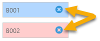
You can switch between different coloring schemas by clicking the appropriate radio button. To remove a sample as a parent, click the  button next to its name:
Displaying variants on maps
Once you are satisfied with your coloring schema and display options, click the Display map button to open the currently selected map in the main view (click Display map and close to display the map and close the Variants dialog). The Variants track will be added to the map:


If you open the Variants dialog again and select a different coloring schema, add/remove samples, sort the samples by a different column, or assign different background colors to the samples, these changes will immediately take effect on the map in the main view.
The Variants track will be automatically added to any map containing any of the currently selected samples, although you can always hide this track if it is not needed.
Analyzing variants
The default Similarity column calculates each sample's similarity to the reference sequence by counting altered alleles: if all of the alleles in the sample are identical to the reference, then its similarity score will be exactly 1; if none of the alleles are similar, the similarity will be exactly 0. This measure is pre-computed for all samples; however, you can compute more sophisticated measures on the fly, and display them as custom columns. To do so, click the Add analysis column item at the bottom of the tree of sample properties. Alternatively, if you already have a map displayed in the main view, you can right-click it and select the Analyze variants option from the popup context menu; you can also right-click a specific highlight to analyze the variants inside it:


The Variant Analysis dialog will then open:

1: The Map region controls display the region on the currently selected map where analysis should be performed. If the selected map is visible in the main view, then the coordinates of its currently visible region will be automatically entered into these textboxes; and if you opened the dialog by clicking a highlight, that highlight's coordinates will be entered instead. You can also edit these values manually, e.g. by pasting in your desired coordinates. For performance reasons, the maximum length of the analysis region is limited (currently to 2Mbp), and so is the maximum number of variant sites in the region (currently 20K). Trying to select a region with too many variants will produce a warning:
Click the  button to open the reference map (if it was not open already) and zoom in to the coordinates of the selected region; click the
  button to set the selected region to the range of nucleotides that are currently visible on the map.
2: The Highlights table displays a list of all the highlights on the map, as well as the coordinates of the currently visible region. You can click a highlight to set the analysis region to its coordinates:
The currently selected highlight (if any) is indicated by the  checkmark.
3: The Formula options describe what kind of analysis should be performed:
Formula type:
- Variant similarity to ref. seq.: Performs the same type of analysis as the default similarity measure, but restricted to the currently selected region and sequence type. If all of the sample's alleles are identical to the reference in the selected region, the score is exactly 1; if all alleles are different, the score is exactly 0.
- Number of variant sites: Simply counts the number of variant sites in the selected region. This count could be different for each sample, e.g. due to sequencing errors.
- Unique variant set: Compares all of the samples in the region to each other pairwise; and collects them into sets, where each set contains all the samples with an identical pattern of alleles.
- All of the above: Packs all of the above information into a single column.
Process variants in:
- Entire sequence: All variants are processed.
- Genes: Only those variants that fall inside gene models are processed; others are ignored. To use this option (and in fact any option besides Entire sequence), you must also select that contains the gene models:

The track must be visible on the map; if it is not currently hidden, you should first make it visible (e.g. by using the map's Track panel). - Exons: Only the variants inside of exons are processed; variants in introns or outside of gene models are ignored.
- CDS: Only the variants inside of CDS regions in exons are processed; others are ignored.
- CDS (translation changes only): As above, but variants with synonymous mutations (those that do not change the gene's translation) are also ignored.
- Gene upstream seq: Only variants inside the sequence upstream of a gene model will be processed; you will be prompted to enter the length of the upstream sequence:

4: After selecting the region for analysis and the formula, you can edit the Name and description of the new column (though doing so is optional).
Finally, click the Submit button to create the column. It will appear in the list of columns on the Variants screen. For example, let's analyze the variants between 7,570 Kbp and 7,577 Kbp that change the translation of gene models on the "Gnomon gene models" track, and aggregate them into variant sets:

The new column appears in the tree of properties on the right-hand side (colored purple to indicate that it is an analysis column):

(click the  button to display the reference map and zoom in on the region covered by the analysis of this column; click the
  button to edit the column or the
  button to delete it.)
We can now sort and filter the table of available samples by this column. For example, we can display only those samples that belong to set #1, and mark all of them in red. To do so, we can first filter the samples...

...and then select them all (e.g. by pressing Ctrl-A), and click on the color swatch in any of the rows:

We can repeat the same process for samples inside of set #2, and mark them in green. We can leave all the other samples un-colored:

In addition, we can group (and sort) the samples by our new "Unique set" column to instantly see the breakdown of samples by set:

For now, let's un-group the samples, and add a few of them to the display:

Here we can see that the samples in set #1 do indeed have identical alleles for all the variants in the region that we'd analyzed (likewise for set #2). While some variants do indicate mutations, they fall outside of the CDS area of this gene, and therefore do not change the gene's translation. This will be easier to see if we zoom into the map...
...or open the SNP Translation dialog:

 Copyright © 2009-2025 by Persephone Software. All Rights Reserved.